THE CLIENT
Carrefour Spain is an omnichannel, multi-format and multi-brand company with 205 hypermarkets, 158 Carrefour Market supermarkets, 1058 Carrefour Express stores and 49 Supeco discount stores in Spain, plus an online store.
THE KEYWORDS
Minimal / Soft / natural / Friendly
THE SOLUTION
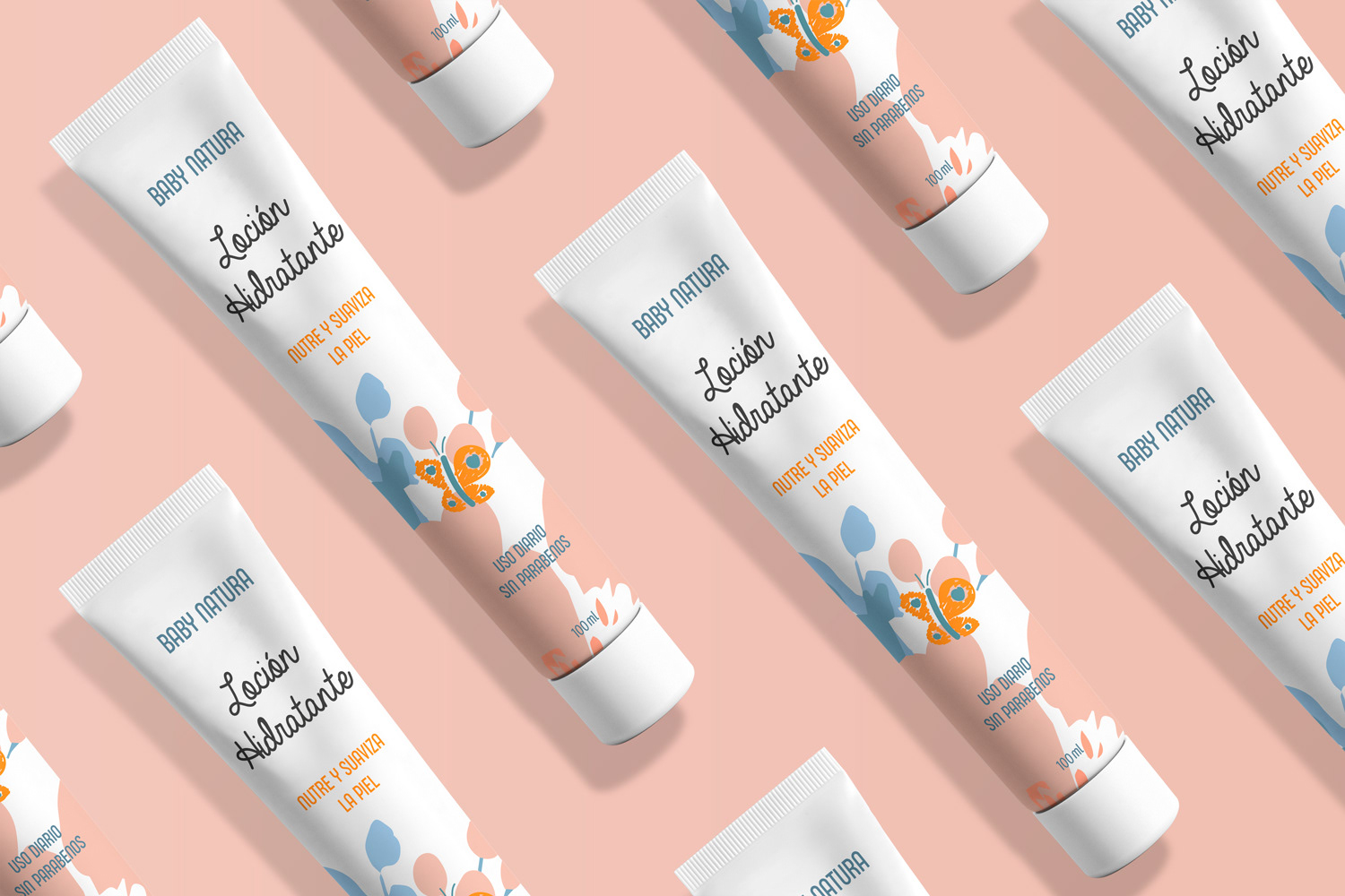
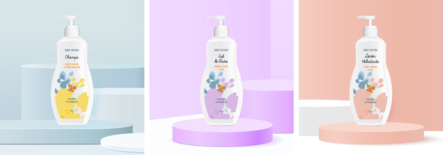
For the visual identity, I have created a bold and soft-edged logotype, for the product name I used Handwritten font, to represent the care and love towards the nature. As for the colour palette, I selected a collection of soft pastel colours combined with the orange colour that is used for the butterfly. Soft pastel colours usually have a calming effect and evoke feelings of care and love. Each product packaging has its own colour scheme and a minimal abstract illustration of fresh flowers. This was done for easier recognition of the product.